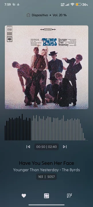
"Now Playing" screen adapted from the N-Thing Player (https://styles.symfonium.app/styles/n-thing-player). The goal is simplicity, beauty, and ease of use. Inspired by Música para Churrasco, Vol. 1.
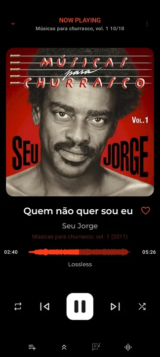
"Now Playing" screen adapted from the N-Thing Player (https://styles.symfonium.app/styles/n-thing-player). The goal is simplicity, beauty, and ease of use. Inspired by Música para Churrasco, Vol. 1.
Hello guys, I make a full application style that looks like apple music
•THE SETTING PAGE IS IN THE BOTTOM OF THE PAGE
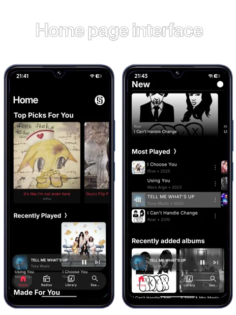
Using my Navidrome Server as a base, focused on high quality album art and artist images, intuitive navigation and library exploration
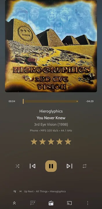
Made to approximate Plex Amp, not 1:1 that's not possible but using their design philosophy
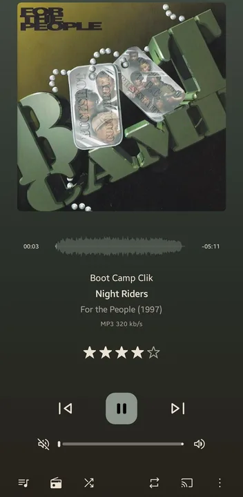
This is my first custom skin for Symfonium, crafted to bring a sleek, modern, and immersive look to your music player. It features deep dark backgrounds paired with rich violet accents with the possibility of change to white mode, creating a calm, moody interface that’s easy on the eyes day or night.
✨ Key Features:
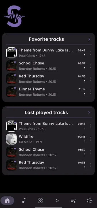
A Now Playing Screen based on Qobuz style.
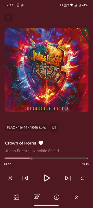
Now playing style full customized including tertiary container text font color, lyric and cover style.
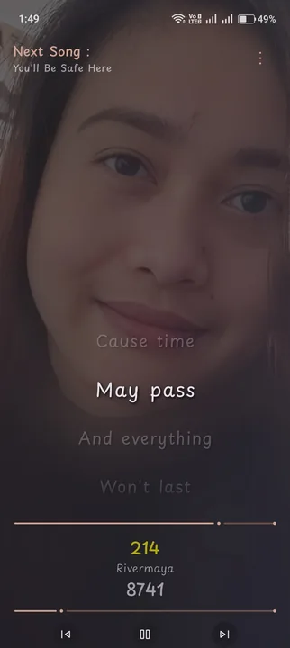
Application Style including menu arrangement, text font colors,Now playing theme and more.
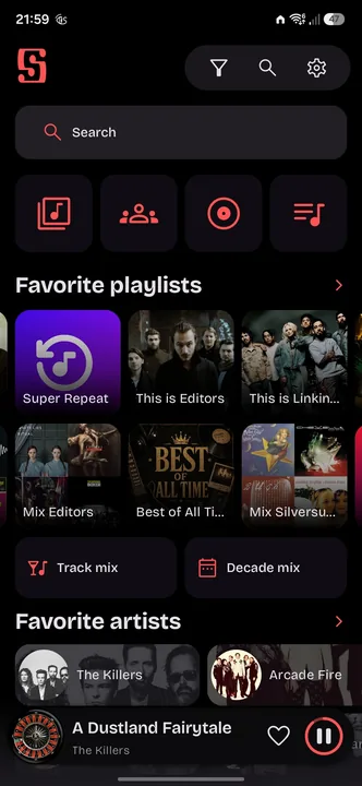
This theme is inspired from "AMO-RED Theme by Celorien")
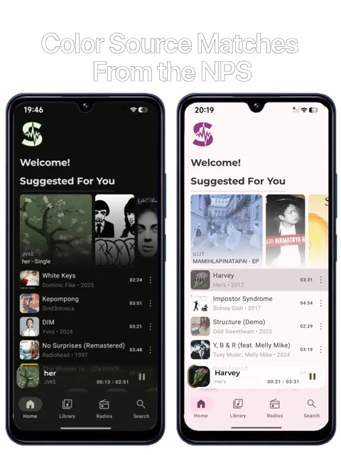
My updated own symfonium style
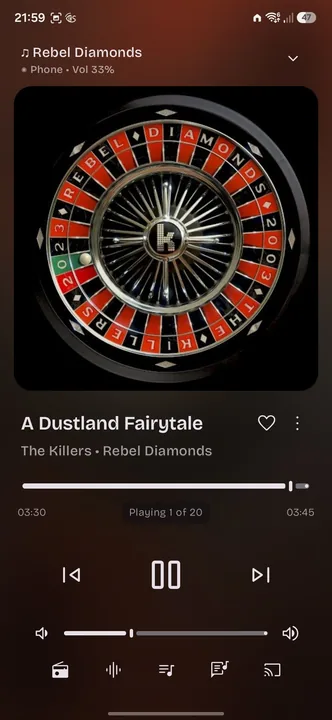
My custom now playing screen.
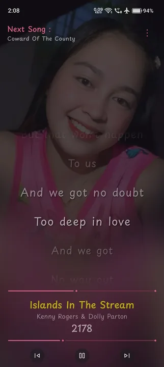
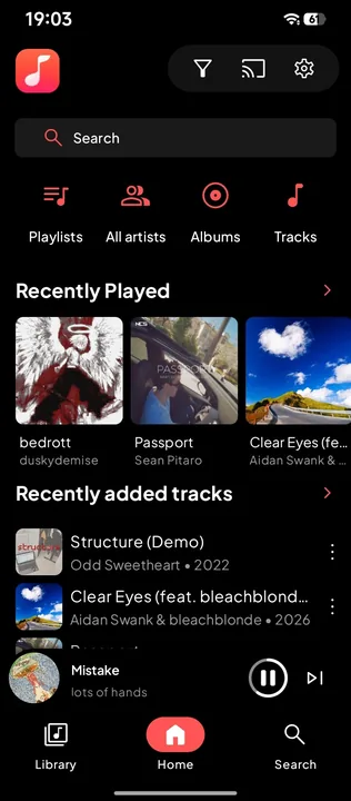
Mi Music Appearance is soo boring, So I make this theme
Mi Music are inspired by another music app called QQ Music/JOOX (Global ver. of QQ music)
Quality badge list:
Portrait mode
Winamp color themes can be used on this style
Don't just skin your player. Elevate it to prestige status.
Press cover art to quickly add to playlist
As few buttons on screen as possible, replacing those function with gestures. For tablets
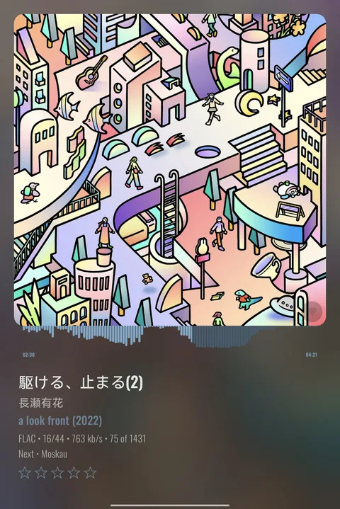
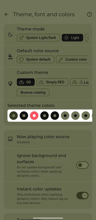
Based on a certain retro handheld's palette, this entire color theme uses only FOUR colors--matching the colors of the past.
Supports Light & Dark modes!
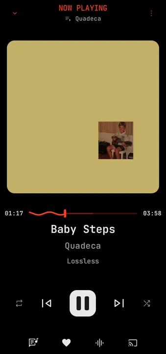
My take on what a music player made by NothingOS might look like.
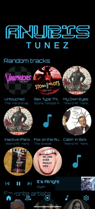
Big fan of the Tron: Legacy aesthetic, and I think a music app is the best way to utilise the scheme.
Uploading for any advice and comments as much as sharing. I have tinkered with this a lot, but I feel like there is something I am missing. I tend to like uncomplicated and uncluttered UI and I feel like this is the best representation of that ideal.
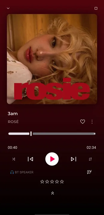
Rate songs quickly
• Press cover art to quickly add to playlist
• Swipe up to access queue
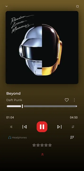
my cool freaking style
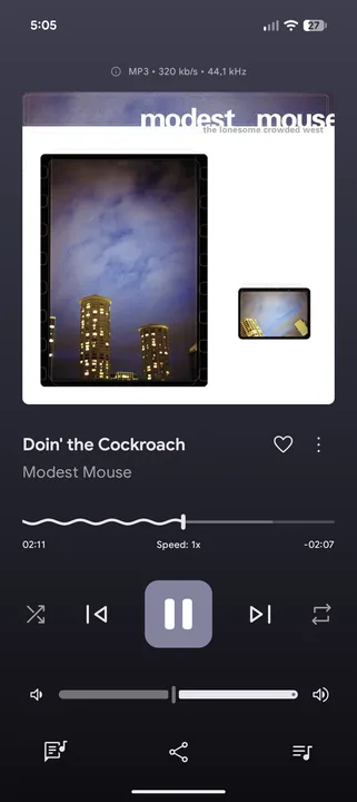
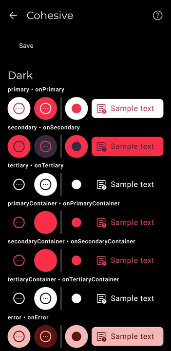
Perfectly showcases clean Material Design colors that deliver exactly what an elite dark theme needs
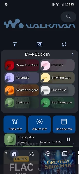
Inspired by the classic Walkman
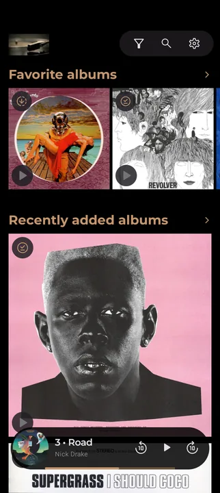
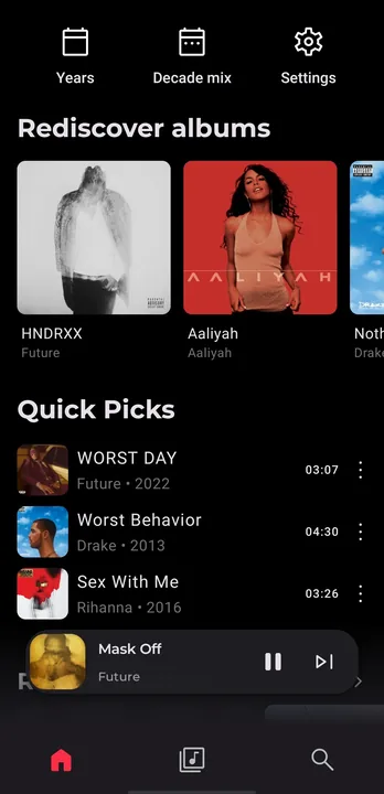
I wanted a unique style with the homepage, that would still be easy to navigate, but also offer decent options from last played album, to discover albums and most played tracks
A vinyl listening experience. I mean... You grab that large and beautiful cardboard thing, pull out the vinyl and put it to spin. No playlists.
Portrait theme! I don't check landscape settings.