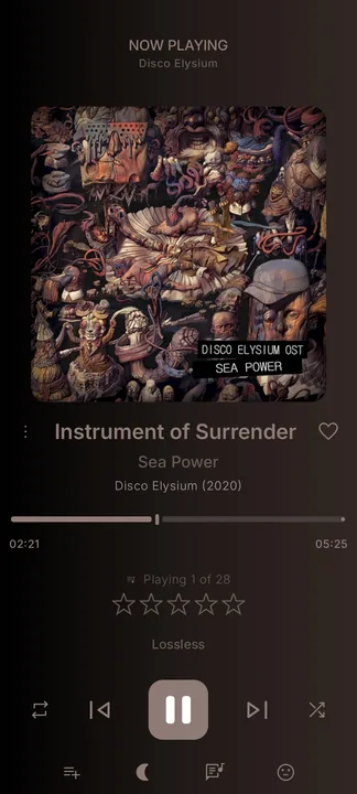
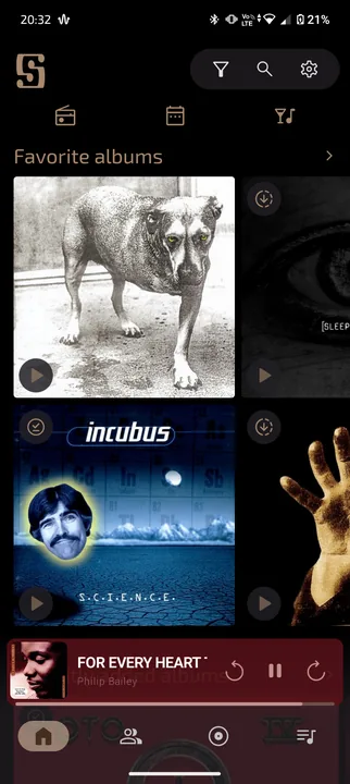
This is my first version of my custom theme for the phone version of symfonium, in some time I will release the tablet version.
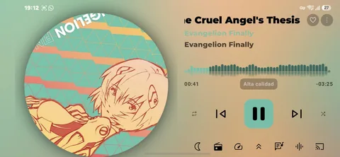
This is my first version of my custom theme for the phone version of symfonium, in some time I will release the tablet version.
The goal of this style is to reduce the amount of scrolling required for general use of the app.
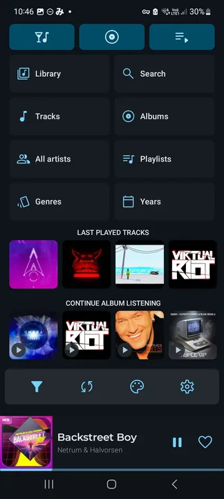
Un tema limpio y simple
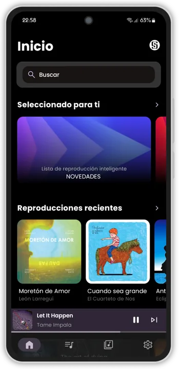
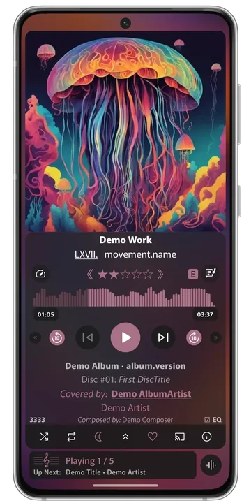
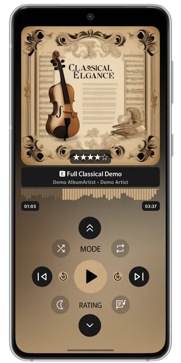
This aims to be the most feature-complete NPS theme available, including dynamic support for Chapter Info, Classical music, and Audiobooks. It also has a secondary “Mini-Player” view, which doubles as a dedicated Chapter player--displaying a secondary progress bar tied to the current chapter.
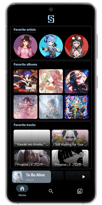
Minimal design - For using the Home Page as a landing screen. There are quick shortcuts but most browsing should be done in the Library tab.
Intended as a 2-3 page layout - I left some gaps to hide the camera cutout... You may need to adjust the spacing a bit to suit your phone. Fortunately, the app makes that easy to do!
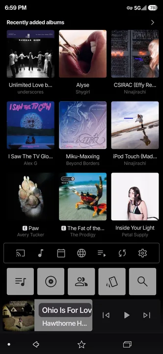
Personal style, uploading for others to use! Pretty streamlined and simple.
Samsung Music inspired now playing theme, design down to the pixel for the best match of porportions possible.

Golden color style, good for black, dark and light themes.
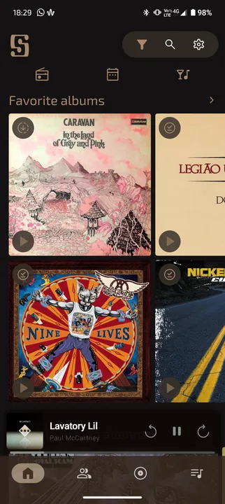
Qobuz inspired now playing theme, design down to the pixel for the best match of porportions possible.

pink and blue theme color for light and dark mode, kaomojis o(>< )o and moving bunny icon.
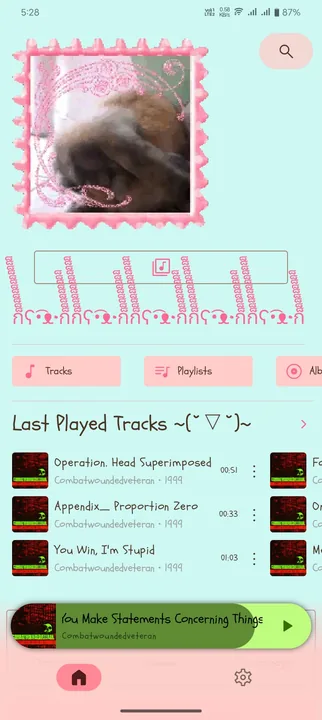
Pink theme, adaptive colors, animated bunny icon, and gaegu font.
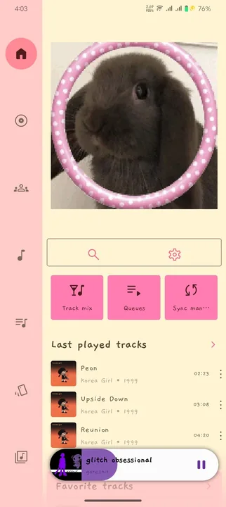
A simple, minimalist style.
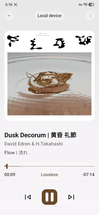
Now playing screen style that I use!
Cover Art shortcuts:
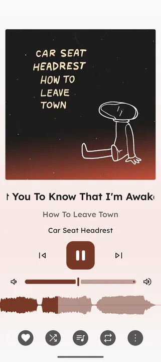
Theme designed to be minimal and for use with an extremely large music library (like mine shown in the screenshots) - Menus are designed to navigate a large library.
Now-playing is designed to be feature-heavy with no loss of functionality whilst still appearing minimal and clean and not detracting from the album presence.
A timeless aesthetic designed around having the album art and artist images be the focus with adaptive colours.
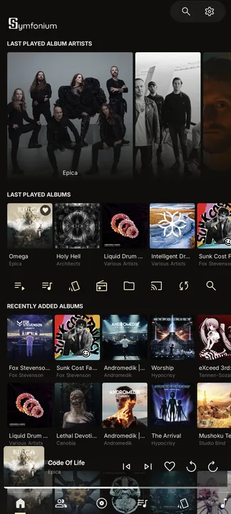
Bring the modern TIDAL experience to Symfonium. This style faithfully recreates TIDAL's latest visual design with carefully crafted layouts, refined details, and a polished Now Playing experience, all adapted to Symfonium's powerful customization system.
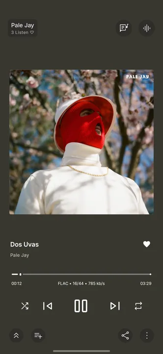
A mishmash of various styles, with a now playing reminiscent of spotify.
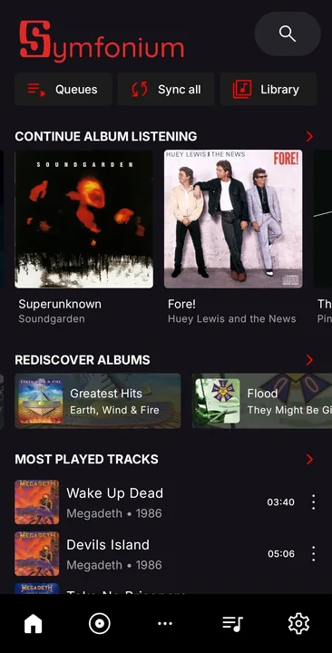
A simple, minimalist style with Material You accents, loosely based on Monochrome.tf
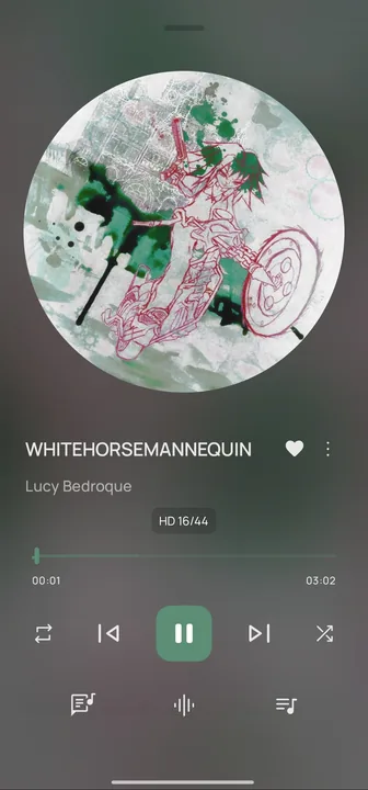
Golden/Brown focused on album covers. It looks good for black, dark and light mode. It's set to use Android's current font. I suggest "Square" (look at the prints).
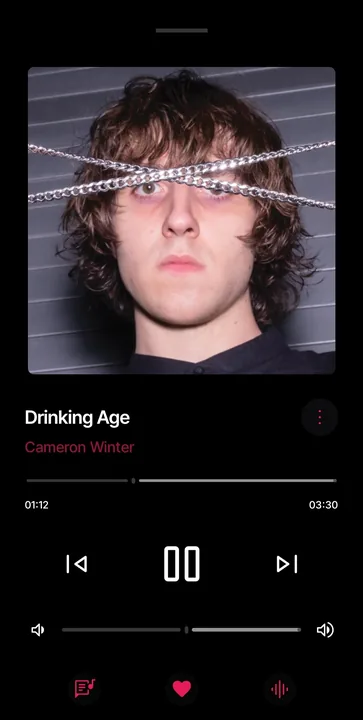
An AMOLED theme based on Apple Music (iOS 13). Color palette based on Apple Music (accent color: #E81A57).
Best used in dark mode only: for a more immersive experience.
For those that remember carrying around a dedicated MP3 player, this was built with a buttons-only mindset.
The default button assignments were chosen to mimic the 4-Way Arrow buttons that many MP3 players had.
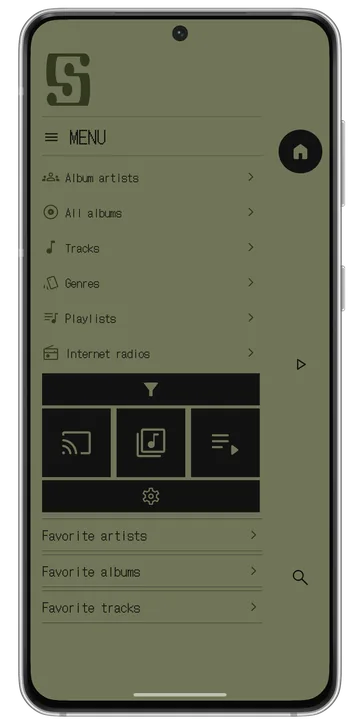
Retro theme that brings back the old Text-Only style that early MP3 players were known for.
Tema inspirado en Apple Music
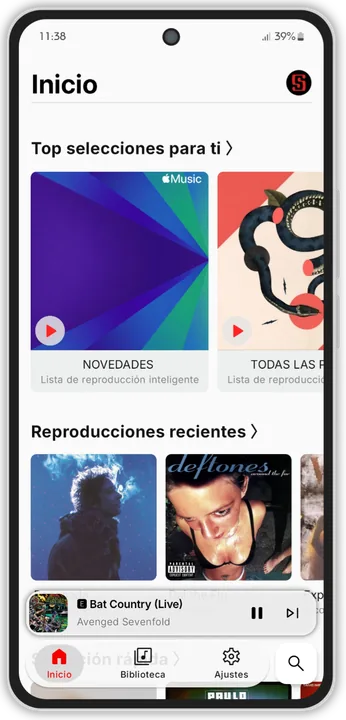
Hello, this is my first theme.
Available only in dark.
There are 2 clickable toggles in the now playing Interface.
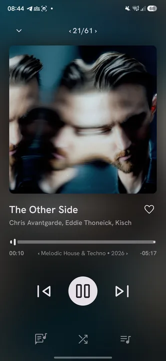
Material You simple and elegant style.