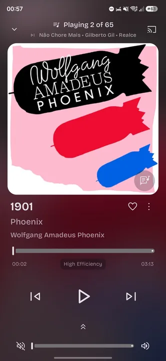
Muted old school color replacement
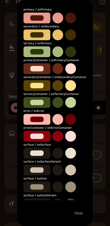
Muted old school color replacement
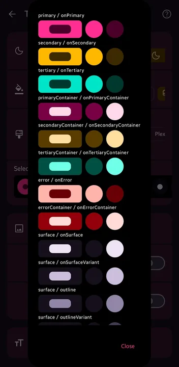
Colorful theme color replacement
Based on Winamp Android App
Portrait
5 color themes
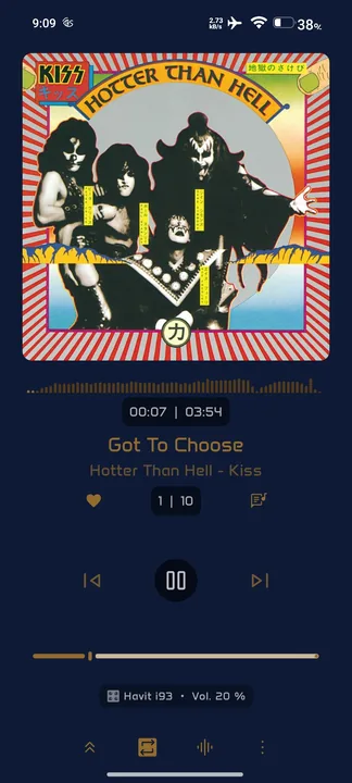
This is the style I use. It works for me. Nothing special about it.
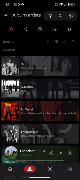
Tema inspirado en spotify
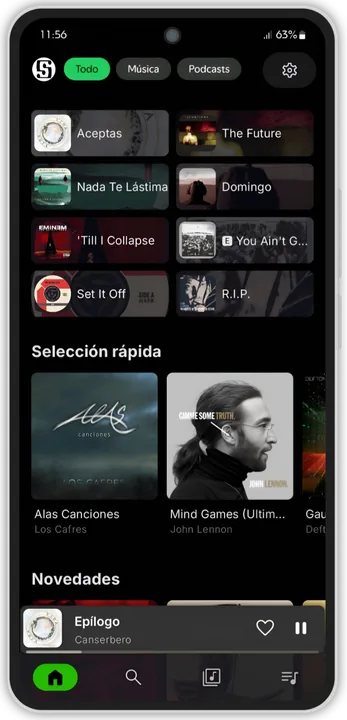
Less clutter only what you need.
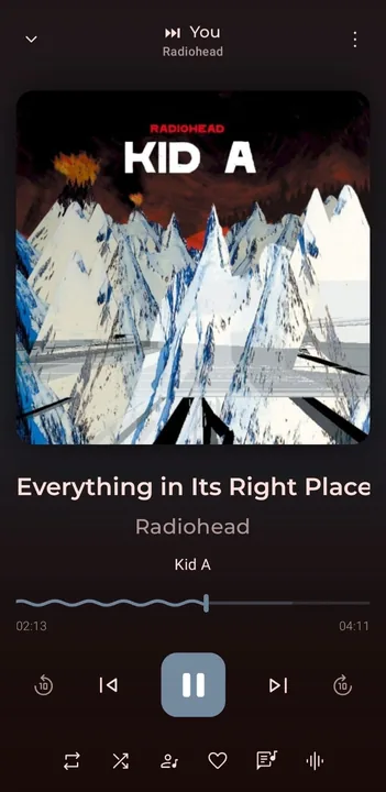
For those who appreciate simplicity.
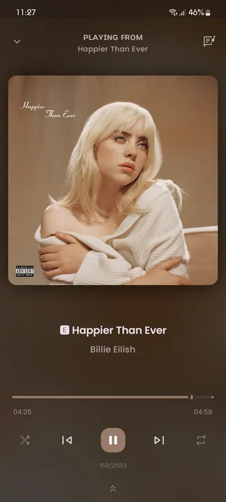
I can't be the only person who misses everything Zune. I've always wanted a modern reinterpretation of this design philosophy and decided to take things into my own hands. I'll continue to tweak this style as I think it still has places to go and any suggestions would be very welcome.
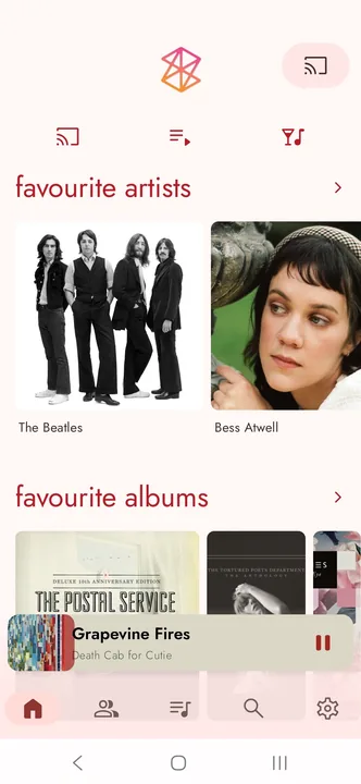
Portrait, Dark mode
Change the font if you don't think it's suitable.
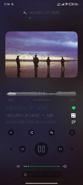
Portrait, Dark mode
Change the font if you don't think it's suitable.
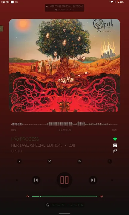
I make a Apple music now playing screen, I think it's accurate tbh (not accurate in landscape)
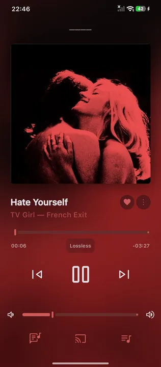
A theme based (loosely) on Tidal and Apple Music.
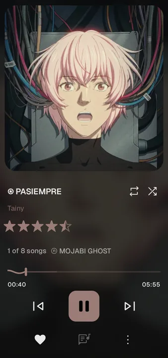
just clean, maybe too clean
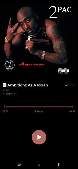
A full app overhaul to look familiar from a certain music service down from player to the home screen.
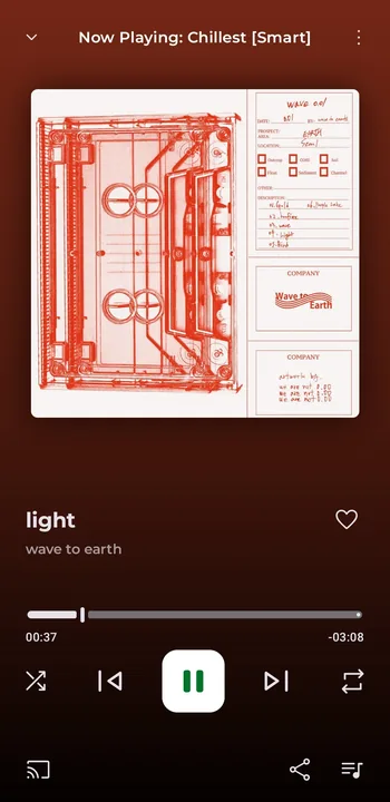
If you find it bad, a good description won't save it.
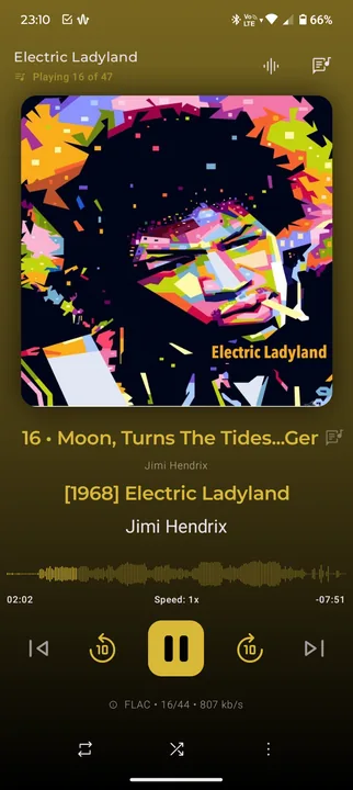
See for yourself, great work
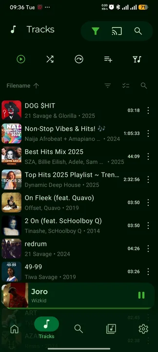
Very improved symphonium general theme, you will like it
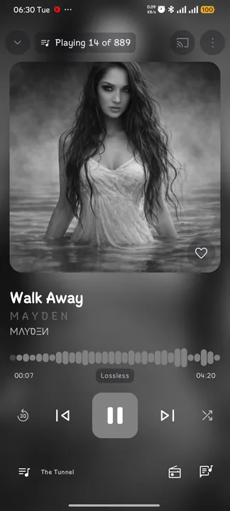
Tablet Version
Only portrait mode
Check mobile version:
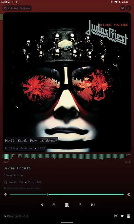
Only portrait mode
Mobile version
Check tablet version:
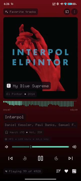
Based on Vix's "Now Playing" screen (source: https://support.symfonium.app/t/my-basic-nuqu-theme/7716)
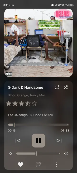
You will love this one
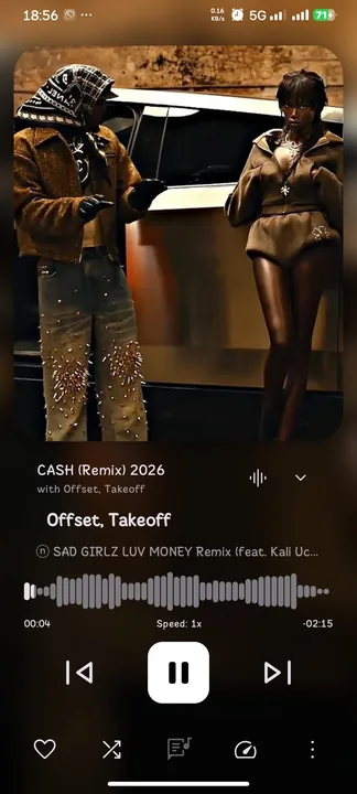
Based on Material 3 You/Expressive, with adaptive colours from the album art or artist image all across the app.
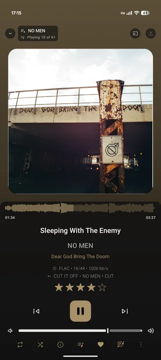
A theme inspired by NothingOS and based on N-Thing Player.
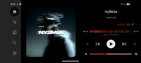
Simple now playing apple based